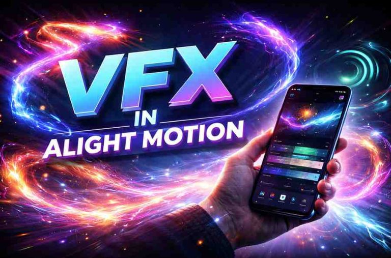
Touring the Alight Motion Interface | Complete Beginner Guide to the App Layout
The first time I opened Alight Motion, I sat there for a good two minutes just staring at the screen, trying to figure out what half the icons even meant while Touring the Alight Motion Interface. No tutorial popped up, no friendly arrow pointed me toward the timeline just a wall of panels and tiny symbols. If you’ve just installed the app on your phone and felt the same way, you’re in good company. Almost every editor who has ever opened Alight Motion has had that exact moment when Touring the Alight Motion Interface for the first time.
Once you actually know what each part of the screen does, though, the whole thing clicks into place fast. I’ve spent enough hours inside this app building reels, fixing other people’s broken projects, and yes, accidentally deleting layers I didn’t mean to to know exactly where everything lives and why it’s arranged the way it is.
This guide takes you through the complete Alight Motion interface and layout, piece by piece, the same way I’d explain it to a friend sitting next to me with their phone in hand. By the end, the home screen, the timeline, the properties panel, and the export settings will all make sense, and you’ll be editing instead of guessing.
What Is the Alight Motion Interface and Why Does It Matter?
Before getting into each panel one by one, it helps to understand what the Alight Motion interface actually is and why it’s built the way it is. Alight Motion is a mobile motion graphics and video editing app for Android and iOS, and its layout is designed to fit a full editing suite onto a phone screen without making it feel cramped.
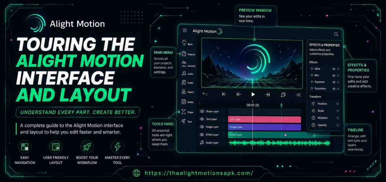
Understanding the Workspace Structure
Alight Motion’s workspace is built around three connected zones: a preview area where you see your video, a timeline where you control timing, and side panels where you adjust properties. These three zones talk to each other constantly.
Move a layer in the timeline, and the preview updates instantly. Once you start seeing them as one connected system instead of three separate screens, the app stops feeling like guesswork and starts feeling like a workspace you actually understand.
How the Interface Improves Video Editing Efficiency
Everything in Alight Motion is positioned to keep your thumb close to the tools you reach for most. The timeline sits at the bottom where it’s easy to control with one hand, the preview window stays large enough to actually judge your edit, and the properties panel only shows options relevant to whatever you’ve selected.
That last detail saves a surprising amount of time you’re never digging through fifteen irrelevant settings just to change one colour.
Exploring the Alight Motion Home Screen
Every project in Alight Motion starts from the home screen, so it’s worth knowing exactly what’s there before you create anything new.
Projects Section and Dashboard
The middle of the home screen lists every project you’ve started, shown as thumbnail cards with the project name, resolution, and the date you last opened it. Tap and hold any card and you’ll get options to rename, duplicate, or delete it.
I rename my projects the moment I create them scrolling through ten cards all labelled “Untitled Project” late at night is not an experience I’d recommend to anyone.
Creating a New Project
The plus button at the bottom centre is how every project in Alight Motion pc begins. Tapping it opens a setup screen asking for resolution (anywhere from 360p up to 4K), frame rate, and a starting background colour.
These choices aren’t permanent you can adjust resolution and frame rate later from project settings but picking the right one upfront saves you from re-exporting a vertical reel that somehow came out square.
Accessing Templates and Saved Projects
If you don’t want to build from scratch, some versions of the app show ready-made templates and sample animations right on the home screen. These are genuinely useful while you’re still learning.
Opening a finished project and seeing exactly how someone else arranged their layers teaches you more in ten minutes than reading about it ever could.
Understanding the Project Workspace
Once a project opens, you land in the actual editing workspace the screen where most of the real work in Alight Motion happens.
The Preview Window Explained
The preview window takes up the top portion of the screen and shows exactly what your project looks like at the current point in time. You can tap directly on it to select an object, drag to move it, pinch to resize, and twist with two fingers to rotate it.
Turning on the safe zone guide, tucked inside the view options, is something I switch on for every single project now, since it shows how the edit will actually look once Instagram or YouTube crops it for their player.
The Top Toolbar and Quick Controls
Right above the preview sits the toolbar holding undo, redo, project settings, and the export button. The undo history in Alight Motion Mod APK goes back surprisingly far, and that genuinely changes how you edit. You can try something risky on a layer without worrying you’ll be stuck with it if it ends up looking terrible.
Navigation Tools and Editing Shortcuts
Tucked inside the three-dot overflow menu are the grid, ruler, and guide overlays. Turning the grid on makes lining up multiple text layers or logo placements far less fiddly, especially on smaller phone screens where eyeballing alignment by hand just doesn’t work.
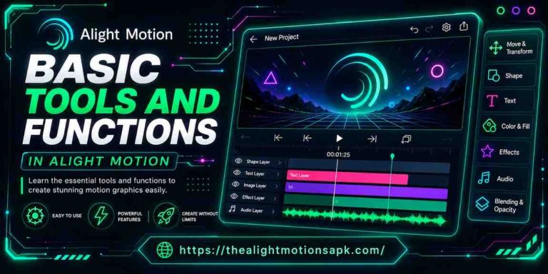
Touring the Timeline and Layer Panel
If there’s one part of the Alight Motion interface worth mastering before anything else, it’s the timeline. This is where every animation, cut, and transition actually comes together.
Timeline Structure and Navigation
At the top of the timeline sits a ruler marked with timestamps, with a vertical playhead showing your current position. Pinch horizontally to zoom in for frame-by-frame precision, or zoom out to see your whole project’s pacing at once.
I zoom in constantly when syncing a cut to a beat, then zoom back out to check the edit still flows as a whole. It’s a habit that takes about a week to build and saves hours after that.
Understanding Layers in Alight Motion
Every video clip, image, text box, or shape you add becomes its own layer, stacked inside the timeline. Order matters here. A layer positioned higher in the stack sits visually in front of layers below it, so a caption placed above your footage will always show on top of it, never behind.
Reordering and Managing Layers
You can drag any layer up or down to change its stacking order, and each layer row carries its own eye icon for hiding it and lock icon for protecting it from accidental edits. On busier projects, grouping related layers together a background bar, a caption, and a small icon that make up one title card, for instance keeps everything moving as one unit instead of slowly drifting out of alignment as you animate.
Keyframes and Animation Controls
A keyframe is simply a saved value for a property at a specific moment in time. Set two keyframes with different values say, one position at the start and a different position two seconds later and Alight Motion fills in everything in between on its own. Tap the diamond icon next to any property to set one. Once basic keyframes feel comfortable, the graph editor is worth exploring too, since it controls how an animation speeds up or slows down rather than moving at one flat speed the whole way through.
The Add Layer Panel and Media Import Options
Tap the plus button inside the workspace itself, not the one on the home screen, and you’ll open the add layer panel the entry point for everything you bring into a project.
Adding Images, Videos, Audio, and Shapes
From this panel you can pull media in from your gallery, add audio tracks, draw vector shapes, drop in a flat colour layer, or place an adjustment layer that affects everything beneath it. That last option is one of the most underused tools in the app. Instead of applying the same colour grade to ten clips individually, one adjustment layer above all of them does the job in a single step.
Media Import and Asset Management
Once a project has several layers, organisation starts to matter a lot. Renaming layers as you add them, rather than going back later to figure out which “Layer 7” is which, keeps a complex project manageable. It sounds like a small habit, but it’s the difference between a twenty-minute editing session and a forty-five-minute one spent hunting for the right clip.
Using Text, Drawing, and Element Layers
Text, shape, and media layers all live inside the same add layer panel, so mixing them a video clip, a hand-drawn vector arrow, and an animated caption happens without switching screens or tools. That’s part of what makes Alight Motion feel more like a compact motion graphics suite than a basic mobile video editor.
Using the Properties Panel to Edit Elements
Select any layer and the properties panel appears, showing only the controls relevant to whatever type of content you’ve tapped.
Transform Controls
Position, scale, rotation, and anchor point all live under transform properties for every layer type. You can type exact numbers when precision matters, or simply drag the handles in the preview window when how it looks matters more than the exact figure.
Color and Blending Settings
Hue, saturation, brightness, and opacity adjustments sit inside the colour section, while the blending mode dropdown changes how a layer mixes with whatever sits beneath it. Screen, Multiply, and Overlay are the three I reach for most. Switching between them on a glow or light leak layer can change the mood of a shot completely, in just a few seconds.
Opacity and Adjustment Options
Opacity is keyframeable just like position or scale, which means a layer can fade in, hold, and fade out entirely through the properties panel without needing a separate transition tool. Combine an opacity keyframe with a small scale change, and you get a soft, polished-looking fade rather than an abrupt cut.
Effects Library and Visual Enhancements
The effects button opens a full library sorted into categories such as blur, glow, distortion, and colour correction. Every effect comes with its own adjustable parameters, and those parameters can be keyframed too, so an effect doesn’t have to sit static through the whole clip. Stack more than one effect on a layer, and the order you apply them in actually changes the result a blur added before a glow looks noticeably different from the same glow added before the blur.
Working with Text Layers and Typography Tools
Text inside Alight Motion goes well beyond a basic caption box, which is part of why so many creators use it for titles and lower-thirds.

Adding and Editing Text
Tap to add a text layer, and a full editor opens with font, size, spacing, and colour controls all in one place. Editing happens directly on the canvas too, so you can see exactly how a caption sits against your footage while you’re still typing it out.
Fonts, Styles, and Alignment Settings
Beyond the built-in font library, Alight Motion lets you import your own TTF or OTF font files through the font manager. That one feature matters more than it sounds it’s what lets brand pages and consistent channel intros use the exact same typeface every time, instead of settling for whatever’s pre-installed.
Text Animation Basics
The text animator lets you animate by character, word, or the whole line at once, which is how creators get letters flying in from different directions or words popping in one after another on beat. It takes a bit of trial and error the first time, but the controls sit right inside the text layer’s properties, so there’s no separate tool to go hunting for.
Vector Shape Tools and Drawing Features
Vector drawing is one of the features that genuinely sets Alight Motion apart from simpler mobile editors, and it’s worth spending real time with.
Creating Shapes Inside Alight Motion
The shape toolbar gives you preset rectangles, ellipses, polygons, and stars, plus a freehand Bezier path tool for anything custom. Because shapes are vector-based rather than pixel-based, they stay perfectly sharp no matter how much you scale them up.
Customizing Stroke and Fill Colors
Each shape can be filled with a solid colour, a gradient, or even another layer’s content used as a mask fill. Stroke width, colour, and corner rounding are all adjustable too, so a simple rectangle can become anything from a clean underline to a rounded button graphic.
Using Vector Graphics for Motion Design
Shapes also work as masks. Turn on the mask property, and a shape will reveal or hide whatever layer sits beneath it based on its own boundaries. Animated masks are how a lot of those clean wipe transitions and spotlight reveal effects you see in edited reels actually get made.
Audio Controls and Sound Editing Features
Audio layers behave a lot like visual ones inside the timeline, with their own bar you can trim, move, and adjust freely.
Importing Audio Files
Music, voiceovers, and sound effects all import through the same add layer panel as video and images. Once added, the audio layer shows up in the timeline with a waveform display, which makes it much easier to spot beats and cut or animate precisely on them.
Adjusting Volume and Timing
Tapping an audio layer opens controls for volume, fade-in, fade-out, and looping. Volume is keyframeable, so dipping the music down the moment a voiceover starts, then bringing it back up once it ends, is something you set up with two or three keyframes rather than a separate ducking tool.
Syncing Audio with Video Clips
Zooming into the timeline makes the waveform clearer and turns beat-matching from a guessing game into something fairly precise. Drag a video cut or a keyframe right onto a visible spike in the waveform, and the sync lands exactly where it should.
Export Screen and Video Rendering Settings
Once the edit is finished, the export screen decides how your finished video actually looks once it leaves the app.
Resolution, FPS, and Quality Options
Export resolution ranges from 360p up to 4K, with frame rate options including 24fps for a more cinematic feel, 30fps for general use, and 60fps for smoother motion. For most reels and shorts aimed at Instagram or YouTube, 1080p at 30fps hits the right balance between sharp quality and a file size that doesn’t take forever to upload on an average mobile data connection.
Export Formats and Saving Videos
Besides standard MP4 video, Alight Motion can export as a GIF, an image sequence for compositing elsewhere, or a project package (an AEMOT file) that shares your fully editable project with other Alight Motion users.
Best Settings for High-Quality Output
The bitrate slider controls how much data goes into encoding each second of footage, and bumping it up is usually the fix if your export comes out blocky or washed out. Free accounts export with a watermark, while upgrading to a paid plan removes it along with unlocking higher resolutions and extra effects.
Useful Tips for Navigating the Alight Motion Interface Faster
A handful of small habits make a real difference once you’re past the basics and editing regularly.
Gestures and Shortcuts
Double-tap a layer name to rename it instantly, pinch the timeline to zoom without hunting for a separate zoom button, and use two-finger gestures in the preview window to scale and rotate together instead of adjusting each one separately.
Organizing Layers Efficiently
Group layers that belong together a title card’s background, text, and icon, for instance the moment you create them, not after the project has already grown messy. It’s a five-second habit that saves a genuinely frustrating clean-up later on.
Common Mistakes Beginners Should Avoid
The most common mistake I see is skipping the preview button and only checking the edit once everything is done. By then, a small timing issue from minute one means re-checking the whole project instead of one small section. Previewing often, even mid-edit, catches problems while they’re still cheap to fix.
FAQ‘s
What are the main parts of the Alight Motion interface?
The Alight Motion interface is built around four main parts: the home screen for managing projects, the preview window for viewing your edit, the timeline for controlling layers and timing, and the properties panel for adjusting whatever you’ve selected.
How do I customize the workspace in Alight Motion?
You can toggle grid lines, rulers, and safe zone guides from the overflow menu, and zoom the timeline in or out depending on whether you need frame-level precision or a wider view of your project’s pacing.
Where is the layer panel located in Alight Motion?
The layer panel sits inside the timeline at the bottom of the workspace, with each layer shown as a horizontal bar that you can trim, reorder, hide, or lock.
How do I access effects and properties in Alight Motion?
Tap any layer to open its properties panel, then tap the effects button inside that panel to browse the full effects library, organised by category such as blur, glow, and colour correction.
Is Alight Motion beginner-friendly?
Yes, once you understand the basic layout. The interface looks dense at first, but every panel only shows options relevant to what you’ve selected, which makes it far less overwhelming after your first couple of projects.
Conclusion
The Alight Motion interface looks intimidating for about a day, and then it doesn’t when you’re Touring the Alight Motion Interface. The home screen keeps projects organised, the workspace puts the preview and timeline within easy reach, and the properties panel only ever shows what’s actually relevant to your current selection.
None of these pieces work in isolation they update together in real time, and that’s what eventually makes the whole app feel less like a set of separate tools and more like one connected workspace.
If you’re just getting started, open a small project, pick one section of the interface, and spend ten minutes exploring just that before moving to the next. That’s genuinely how most people, myself included, end up comfortable enough to stop thinking about where things are and start focusing on the actual edit.