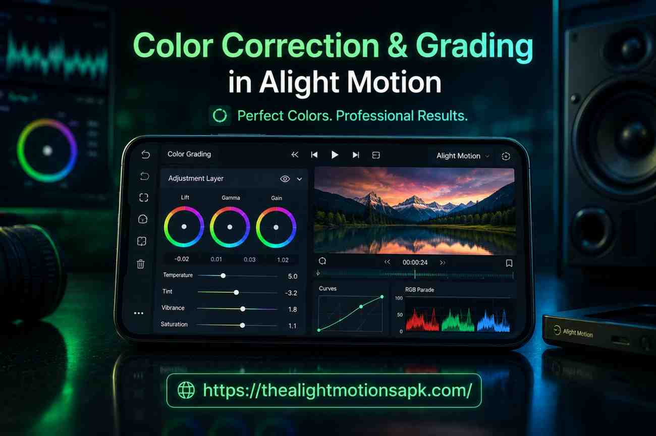
Color Correction & Grading in Alight Motion (Complete Beginner-to-Pro Guide)
If you have ever recorded a video that looked amazing while filming but felt flat, dull, or weirdly tinted when you played it back, you already understand the problem that Color Correction & Grading in Alight Motion solves. I still remember the first travel reel I edited on Alight Motion.
The footage was shot at golden hour, yet somehow it came out looking pale and slightly greenish. I spent twenty minutes adjusting Temperature and Exposure, and when I finally hit play, it looked like a completely different video warm, cinematic, and vivid. That one experience made me obsessed with color work and showed me the true value of Color Correction & Grading in Alight Motion.
Color correction and grading in Alight Motion are two of the most powerful and most underused skills among mobile video editors. Most creators jump straight to transitions and text animations, completely ignoring the color panel. That is a mistake. Nail your colors, and everything else in your edit automatically looks more professional.
This guide covers everything from understanding the basic concepts to applying advanced grading techniques the same way I learned it through hands-on editing sessions on my own phone.
What Is Color Correction in Video Editing?
Color correction is the technical process of fixing problems in your raw footage so that it looks the way the scene actually appeared in real life. Your camera, whether it is a smartphone or a DSLR, does not capture light exactly the way your eyes see it. The result is footage that can look too bright, too dark, too warm, too cool, or tinted in unexpected ways.
Color correction brings all of that back to a neutral baseline natural skin tones, accurate white balance, proper exposure, and clean shadows and highlights. It is not about making things look stylized. It is about making things look correct.
Why Color Correction Is the First Step in Editing?
Every professional colorist follows the same rule: correct first, then grade. If you skip correction and go straight to adding a creative look, you are building on a broken foundation. A warm cinematic grade applied over footage that already has a yellow color cast will look muddy and over-processed. But that same grade applied to corrected, balanced footage will look clean and intentional.
Think of color correction the way you would think of washing a canvas before painting. The cleaner the base, the more control you have over the final result.
Common Issues That Color Correction Fixes
Through editing dozens of projects on Alight Motion, these are the most common problems I run into:
- Overexposed clips from shooting in direct sunlight highlights get blown out and lose detail
- Underexposed footage from shooting indoors or in low light shadows become noisy and flat
- Wrong white balance footage looks too orange under warm indoor bulbs or too blue under overcast skies
- Color cast a green tint from fluorescent lighting or a magenta shift from certain LED panels
- Washed out colors low contrast footage that feels lifeless and flat
All of these issues are fixable inside Alight Motion using the right tools in the right order.
What Is Color Grading in Alight Motion?
Color grading is the creative step that comes after correction. Once your footage looks natural and balanced, grading is where you give it a personality. You decide the mood, the atmosphere, and the visual style. Should your video feel warm and nostalgic? Cold and dramatic? Bright and poppy for social media? That choice is what grading is all about.
In Alight Motion, both correction and grading happen inside the same app inside the Effects & Fill panel, which is a core part of how Color Correction & Grading in Alight Motion works in practice. That is what makes Alight Motion APK genuinely powerful for mobile editors. You do not need to export your footage to a desktop app to achieve professional color results.
How Color Grading Enhances Visual Style?
Color grading is what separates a raw video from a visual experience. When you watch a well-graded travel video, you do not consciously notice the colors you just feel the warmth and the adventure. When you watch a thriller, you do not think about the teal shadows you just feel the tension. That invisibility is the mark of great color work. The grade supports the story without calling attention to itself.
Alight Motion gives you enough control to create that kind of intentional visual style even on a phone.
Difference Between Technical Correction and Creative Grading
Here is the clearest way I can explain this distinction:
Correction is about accuracy. Grading is about intention.
Correction asks: does this footage look real?
Grading asks: how do I want it to feel?
A corrected clip can stand on its own as a clean, neutral piece of footage. A graded clip has a point of view a color story that tells the audience how to feel before a single word is spoken.
Color Correction vs Color Grading: Key Differences Explained
| Color Correction | Color Grading | |
| Goal | Fix technical problems | Add mood and visual style |
| Type | Technical | Creative |
| Order | Always done first | Done after correction |
| Tools Used | Exposure, Temperature, White Balance, Shadows/Highlights | Curves, Hue Shift, Presets, RGB Split, Gradient Maps |
| Example | Fix blue-tinted indoor footage | Apply teal-orange cinematic tone |
Purpose and Workflow of Each Process
In a professional color workflow, correction and grading are always treated as separate stages even if they happen inside the same tool. You complete correction on every clip before you begin grading any clip. This keeps your workflow clean and prevents grades from looking inconsistent across different shots.
When to Use Color Correction and When to Use Color Grading
Use color correction on every single clip, always. There is no footage that does not benefit from at least a basic white balance and exposure check. Use color grading when you want to build a specific mood or visual identity for your project vlogs, short films, reels, cinematic edits, music videos. Not every video needs an aggressive grade, but every video needs proper correction.
Why Color Correction and Grading Matter in Video Editing?
Improving Overall Video Quality
Here is something I noticed early in my editing journey: a video with average camera quality but excellent color work consistently outperforms a video shot on a better camera with poor color work. Colors affect how polished your content feels, and polish determines whether viewers keep watching or scroll past.
On platforms like Instagram Reels, YouTube Shorts, and Snapchat, the thumbnail and first three seconds of color are often what decides whether someone stops or keeps scrolling.
Creating Mood, Emotion, and Storytelling
Colors trigger emotional responses this is not a theory, it is something filmmakers and advertisers have relied on for decades. Warm amber tones create feelings of safety, comfort, and nostalgia in Color Correction & Grading in Alight Motion.
Cool desaturated blues feel distant, melancholic, or clinical. High contrast deep shadows suggest tension or mystery. Bright, airy tones with lifted shadows feel optimistic and energetic.
When you grade your videos with emotional intent, you are doing what every professional cinematographer does you are using color as part of your storytelling toolkit.
Maintaining Professional Visual Consistency
If you are building a YouTube channel, Instagram page, or any kind of content brand, visual consistency is one of the most powerful branding tools available to you. When every video in your feed has a similar color signature the same warmth, the same contrast, the same feel your audience starts recognizing your work before they even see your name. Alight Motion’s preset saving feature makes this possible even for solo creators working entirely on mobile.
Color Editing Tools Available in Alight Motion
Alight Motion’s color panel is more capable than most mobile editors. Here is a complete breakdown of every tool you will work with.
Brightness and Contrast Controls
Brightness lifts or lowers the overall luminance of your clip uniformly. Use it to fix footage that feels too dark or too washed out. Contrast controls the distance between your lightest and darkest values. Increasing contrast gives your footage more punch and depth. A good starting point for most footage is Brightness between 0 and +10, and Contrast between +10 and +20.
One mistake I made early on was pushing Brightness too high the footage started to look flat and hazy. The fix was to use less Brightness and more Contrast to create depth while keeping the overall image from looking blown out.
Exposure Adjustments
Exposure is different from Brightness. While Brightness shifts everything uniformly, Exposure mimics how the camera’s sensor responds to light. It affects shadow detail and highlight recovery in a more organic way.
If your footage is overexposed and losing sky detail, reducing Exposure pulls those highlights back. If your indoor footage looks muddy and underlit, a slight Exposure boost opens up the image naturally.
Saturation and Hue Shift
Saturation controls the intensity of all colors. Pull it down for a moody, de-saturated look. Push it up for vibrant, energetic footage. For natural-looking content, a saturation increase of +10 to +20 is usually the sweet spot enough to make colors pop without looking fake.
Hue Shift rotates every color in your clip around the color wheel. A small shift of 5 to 10 degrees can subtly change the temperature and feel of a scene without being obvious. Large shifts create stylized or surreal looks useful for creative edits, less useful for natural footage.
Temperature and Tint Settings
These two tools together are your white balance control. Temperature moves between cool (blue) and warm (orange/yellow). Tint moves between green and magenta. When I am correcting footage shot under mixed indoor lighting, I almost always need to reduce Temperature slightly and nudge Tint toward magenta to remove the green cast from fluorescent bulbs. Getting these two right is the single most impactful correction step.
Shadows and Highlights
Shadows lets you either lift dark areas to recover hidden detail or crush them for a dramatic, high-contrast look. Highlights lets you recover bright areas that might be losing detail particularly useful for footage with bright windows or outdoor skies in frame. Using these together, you can compress your footage’s dynamic range without touching the overall exposure a technique called “tone mapping.”
Curves and Advanced Color Controls
The Curves tool is the most powerful color control in Alight Motion and the one that took me the longest to understand. It lets you adjust brightness and color independently across three zones: shadows, midtones, and highlights. You can pull down just the shadows while keeping midtones and highlights untouched.
Or you can create an S-curve a classic technique that deepens shadows and brightens highlights simultaneously, giving footage a punchy, film-like contrast.
Curves also has RGB channels (Red, Green, Blue). By adjusting individual color channels in specific tonal ranges, you can create sophisticated grades that no slider alone can achieve.
Professional Effects for Creative Color Editing
Beyond the core sliders and curves, Alight Motion offers effects like Gradient Maps, Color Replace, RGB Split, Glow, and Chromatic Aberration. These move beyond correction into purely stylistic territory and are what allow Alight Motion editors to create looks that rival desktop-edited content.
How to Do Color Correction in Alight Motion?(Step-by-Step)
This is the exact workflow I follow every time I start a new project. Follow this order skipping steps or doing them out of sequence is the most common beginner mistake.

Step 1: Import Your Video Clip
Open Alight Motion and create a new project. Set your aspect ratio before importing 9:16 for Reels and Shorts, 16:9 for YouTube, 1:1 for Instagram feed posts. Tap the + button, select Video, and import your clip from the gallery. Make sure your project resolution matches your footage quality. For most social media content, 1080p at 30fps is the right starting point.
Step 2: Adjust Exposure, Brightness, and Contrast
With your clip layer selected, go to Effects & Fill → Color & Light. The first thing I check is Exposure. Is the footage too bright or too dark? Adjust Exposure first it gives you the most organic control over overall lightness. Once Exposure is right, fine-tune Brightness if needed, then set Contrast to add depth. Recommended starting values for outdoor daylight footage: Exposure 0 to +5, Contrast +10 to +20.
Step 3: Correct White Balance with Temperature and Tint
This is the step most beginners skip and it is the one that makes the biggest difference. Adjust Temperature until the whites in your frame actually look white. Then adjust Tint to remove any green or magenta cast. A practical test: find a white wall, a white shirt, or a piece of paper in your footage. If it looks orange, cool down the Temperature. If it looks blue, warm it up. If it looks green, push Tint toward magenta.
Step 4: Remove Unwanted Color Cast
Sometimes footage has a persistent color cast even after white balance is corrected this often happens with mixed lighting sources. Use Hue Shift in small increments (1 to 5 degrees at a time) to neutralize subtle color problems. For casts that are isolated in the shadows or highlights specifically, target those zones using Color Curves.
Step 5: Balance Shadows and Highlights
Use the Shadows control to either lift dark areas (good for revealing detail in underlit footage) or crush blacks slightly for a cinematic, rich look. Use Highlights to bring back detail in overexposed areas. At this point in the workflow, your footage should look clean, balanced, and natural ready for the creative step.
Step 6: Fine-Tune Saturation and Color Accuracy
The last step in correction is a Saturation check. Boost it slightly if colors feel dull (+10 to +15 is usually enough). Pull it back if colors feel oversaturated or unnatural. At this stage, never over-boost correction saturation is about accuracy, not style. Save the creative saturation choices for grading.
How to Apply Color Grading in Alight Motion?
Grading starts where correction ends. Your footage is now clean and balanced. Now you give it a look.
Creating a Cinematic Look
The cinematic look that creators most often want is the teal-and-orange grade used in everything from Hollywood blockbusters to travel documentaries. Here is how to achieve it in Alight Motion:
First, reduce Saturation slightly (-10 to -15). Then increase Contrast (+20 to +25). In Color Curves, pull the shadows slightly toward blue/teal using the Blue channel. Then push the highlights slightly warmer using the Red channel.
Finally, lift the Shadows slider just a touch so pure blacks become very dark gray this is called “lifting the blacks” and it gives footage that characteristic film-look feel. The whole process takes about five minutes once you understand the logic.
Using Colors to Convey Mood and Emotion
Before I touch a single slider for grading, I ask myself one question: how do I want this video to feel? That question guides every grading decision. For a warm nostalgic travel vlog, I raise Temperature, reduce Contrast slightly, and lift Saturation gently.
For a dark atmospheric edit, I crush shadows, reduce Brightness, and shift the overall tone toward cool blues and teals. Let the emotional intent drive the tools not the other way around.
Applying LUT-Inspired Presets and Filters
After building a grade I am happy with, I save it as a preset inside Alight Motion. Go to your Color & Light effect settings, tap the three-dot menu, and select Save as Preset. Name it something descriptive “Cinematic Warm”, “Dark Moody”, “Summer Vlog”.
From that point, you can apply the exact same grade to any clip in one tap. This is what professional colorists call a “LUT workflow” and Alight Motion’s preset system does something very similar at the mobile level.
Matching Multiple Clips for Consistent Colors
This is one of the most practical skills in color work. When you have multiple clips shot at different times or in different lighting conditions, they will not automatically match. Start by applying your base correction to each clip individually.
Then apply the same grade preset across all clips. For clips that still look slightly off, isolate the difference it is almost always a Temperature or Brightness mismatch and fine-tune just those two controls per clip while keeping Saturation and Contrast consistent across everything.
Popular Color Grading Styles to Try
Cinematic Teal and Orange Look
Reduce Saturation by 10 to 15. Increase Contrast by 20 to 25. Use Curves to push shadows toward teal (lift the Blue curve in shadows) and highlights toward warm orange (lift Red curve in highlights). Lift blacks slightly. This is the most universally popular grade for dramatic, cinematic content.
Warm Vintage Style
Raise Temperature by 15 to 20. Reduce Saturation by 10. Lift Shadows to dark brown rather than pure black. Add a slight film grain overlay if available. This recreates the warm, slightly faded look of analog film photography.
Moody Dark Tone
Reduce Brightness to -10. Crush Shadows toward pure black. Lower Saturation by 15 to 20. Shift Temperature slightly toward cool. This look works exceptionally well for dramatic short films, emotional music videos, and anything with a heavy, introspective mood.
Bright Social Media Aesthetic
Increase Brightness by 10 to 15. Reduce Contrast slightly. Boost Saturation by 15 to 20. Lift Shadows to give the image an airy, soft feel. This grade is extremely popular for lifestyle content, beauty videos, and fashion-forward Instagram Reels it feels clean, light, and highly shareable.
Neon and Cyberpunk Style
Add an RGB Split effect for a slight channel offset. Boost Saturation aggressively (+30 to +50). Add Glow effects in electric blue, pink, or green using the Light Glow effect with Add blending mode. Reduce Brightness slightly to deepen the background and make the neon tones pop. This style works best for gaming content, music edits, and futuristic themed videos.
Advanced Color Effects in Alight Motion
Glow and Soft Glow Effects
The Glow effect in Alight Motion adds a luminous halo around bright areas of your footage a look commonly associated with dreamy, ethereal, or cinematic content. The Soft Glow variant creates a gentler, more diffused version of the same effect.
I use Soft Glow at low opacity (20 to 30%) as a finishing touch on almost every warm-toned grade it adds a subtle warmth and polish that is hard to define but immediately visible.
To apply: go to Effects → Light → Glow. Adjust Radius, Threshold, and Intensity. Keep the Intensity low for a natural feel; push it higher for a more stylized, dreamlike result.
RGB Split Effects
RGB Split separates the Red, Green, and Blue color channels of your footage and offsets them slightly, creating a chromatic aberration effect that mimics old VHS tapes or glitchy digital screens. It is a polarizing effect some audiences love it, some find it distracting. Use it sparingly. A very subtle RGB Split (offset of just 2 to 4 pixels) adds texture and edge to a grade without being obvious. A dramatic split becomes a feature of the edit, not just a color touch.
Gradient Maps and Color Replace Effects
Gradient Maps replace the full tonal range of your footage shadows, midtones, and highlights with a custom color gradient. This is a powerful way to create stylized looks that go beyond what sliders alone can do. A black-to-orange gradient map on a night scene can create a dramatic, high-contrast cinematic look. A cool purple-to-white gradient can create an ethereal, otherworldly atmosphere.
Color Replace lets you isolate a specific color in your footage and swap it for a different one. Useful for creative choices like changing the color of a car, a piece of clothing, or an environmental detail without affecting the rest of the frame.
Combining Effects for Unique Looks
The most interesting grades I have ever created on Alight Motion came from stacking effects in unexpected combinations. A Soft Glow at low opacity combined with a slight RGB Split and a warm Temperature grade produces a look that feels simultaneously vintage and modern nostalgic but sharp.
Experiment with effect order and blending modes. Alight Motion’s layer-based system lets you stack these effects on the same clip, and the results can be genuinely striking.
Advanced Color Correction Techniques
Using Curves for Better Contrast and Color Balance
The Curves tool unlocks a level of precision that sliders simply cannot match. Here is the technique I use most often: create a gentle S-curve on the master (RGB) channel pull the shadows down slightly and the highlights up slightly. This immediately adds punch and depth to flat footage.
For color balance, switch to individual channels. Pull the Blue curve down in shadows to warm your dark areas. Pull it up in highlights to keep the sky and light sources cool. This split-tone effect using curves is the foundation of most professional cinematic grades.
Working with High Quality Footage
The quality of your corrections and grades is directly limited by the quality of your source footage. If you can, shoot in the highest resolution and bitrate your phone supports. On most modern Android and iOS devices, this means 4K at 30fps or 1080p at 60fps. Avoid heavy compression settings if your phone offers a choice.
Higher quality source footage gives color tools more data to work with corrections look cleaner, gradients are smoother, and you have more room to push contrast and saturation without introducing artifacts.
Matching Shots for Seamless Visual Consistency
When matching shots across a project, I follow a three-step process. First, correct each clip individually to a neutral baseline. Second, apply the same grade preset. Third, do a final pass where I play all clips back-to-back and look for mismatches in brightness or color temperature, then adjust those individual clips by no more than 5 to 10 points in Brightness or Temperature until they blend together seamlessly.
Building a Professional Color Workflow
The difference between creators who improve quickly and those who stay stuck is workflow. Having a repeatable process correct every clip, then grade, then match, then fine-tune means every project gets better than the last in Color correction and grading in Alight Motion.
After six months of following this workflow in Alight Motion, I stopped thinking about individual tools and started thinking in terms of the final image. That shift is what professional-level color work actually feels like in Color correction and grading in Alight Motion.
Best Settings for Color Correction in Alight Motion
Recommended Brightness and Contrast Levels
For general-purpose video content, these starting values work well across most footage types:
- Brightness: 0 to +10 (avoid pushing above +15 it introduces haze)
- Contrast: +10 to +20 for standard footage; +20 to +30 for cinematic-style edits
- Exposure: Start at 0 and adjust by no more than ±15 in either direction
Always judge by eye against your specific footage these are starting points, not rules.
Ideal Saturation for YouTube Shorts and Reels
- Natural vlog content: +10 to +15 Saturation
- Lifestyle and fashion content: +15 to +25
- Cinematic and dramatic content: -5 to +10 (lower saturation for serious moods)
- Bright social media content: +20 to +30 (vibrant, punchy, eye-catching)
Anything above +40 starts looking unnatural on most footage types. On skin tones especially, over-saturation looks bad quickly.
Export Settings After Color Grading
When exporting a graded project from Alight Motion, always export at the highest available quality setting. For YouTube Shorts and Instagram Reels, 1080p at 30fps with high bitrate is the standard. For 4K capable projects, export at 2160p if your content is going to YouTube or a large-screen platform.
Enable high quality rendering in export settings. Do not export to a compressed format like 360p or 480p both platforms re-compress your video during upload, and a low-bitrate original makes that compression much more visible.
Maintaining Quality During Rendering
One common issue I have seen including in my own early projects is banding: visible stripes in gradients (like skies or backgrounds) that appear after export. This happens when saturation or contrast is pushed too far, combined with low-bitrate source footage. The fix is to keep corrections within reasonable ranges, avoid pushing any single slider to its extreme, and always export at the highest quality settings your device supports.
Common Color Correction and Grading Mistakes to Avoid
Over-Saturating Colors
This is the number one mistake beginners make. When you first discover the Saturation slider, it is tempting to push it high because the colors look vivid and exciting in the preview. But over-saturated footage looks cheap, artificial, and tiring to watch. Skin tones go orange, greens become neon, and the overall image feels digitally processed rather than natural. Keep Saturation increases moderate the goal is for viewers to feel the colors without noticing them.
Incorrect White Balance
Skipping white balance correction is like building on a crooked foundation. Every other adjustment you make will be fighting against the wrong color temperature. Even a small white balance error compounds during grading if your footage is slightly blue and you try to add a warm grade on top, the result will look greenish and inconsistent. Always correct white balance before doing anything else.
Excessive Contrast and Sharpness
High contrast can make footage look punchy and professional but push it too far and you lose detail in both shadows and highlights. Pure black shadows with no detail and blown-out white highlights are signs of over-contrasted footage. Similarly, over-sharpening makes footage look harsh and artificial, especially on skin. Aim for contrast that adds depth without destroying tonal information.
Inconsistent Colors Between Clips
If every clip in your edit has slightly different colors some warm, some cool, some bright, some dark the edit feels disjointed and amateurish. This is one of the most common problems in mobile-edited content and one of the easiest to fix once you have a consistent workflow. Apply your correction and grade presets uniformly, then do a final review pass specifically looking for consistency.
Practical Tips and Pro Workflow for Better Results
Use Reference Images for Accurate Colors
One technique I borrowed from professional colorists is using reference images. Find a still from a film, music video, or other content that has the color look you are going for. Open it on a second screen or a reference monitor while you work. Compare your grade to the reference regularly. This prevents you from drifting too far in any one direction and gives you a clear target to work toward.
Edit Under Proper Screen Brightness
This sounds like a small thing but it matters significantly. If your phone screen brightness is too low, you will over-compensate and make your footage too bright. If your screen is too bright, your footage will look good in the edit but too dark when viewed on other screens. Edit with your screen brightness set to around 70 to 80% in a normally lit room. Avoid editing in direct sunlight it makes accurate color judgment impossible.
Save Presets for Faster Workflow
Every time you create a grade you are happy with, save it as a preset immediately. Build a library of presets over time one for indoor warm lighting, one for outdoor daylight, one for cinematic content, one for social media. With a solid preset library, your color workflow for a new project drops from 30 minutes to 5 minutes. That saved time adds up quickly when you are creating content consistently.
Maintain Consistency Across Projects
The long-term goal of color work is consistency. Your audience should be able to recognize your visual style across different videos, different locations, and different subject matter. That recognition builds brand loyalty. Choose a signature color direction whether it is warm and golden, cool and clean, or dark and cinematic and lean into it consistently. Evolve it over time, but keep enough continuity that your channel or profile has a visual identity.
FAQ’s
Can I Do Professional Color Grading in Alight Motion?
Yes, absolutely. Alight Motion’s color tools, particularly Curves, Temperature and Tint, Shadows and Highlights, and the full effects library, are capable of producing results that look indistinguishable from desktop-edited content at the social media level. The limitation is not the tool it is the knowledge of the person using it. With proper technique, Alight Motion produces genuinely professional color grades.
Which Color Settings Are Best for Cinematic Videos?
For a cinematic look, the most effective combination is: reduce Saturation by 10 to 15, increase Contrast by 20 to 25, lift Shadows slightly so blacks become dark gray rather than pure black, and apply a teal-orange split tone using Curves (cool shadows, warm highlights). This combination is the foundation of the look most people associate with cinematic video.
What Is the Difference Between Saturation and Hue?
Saturation controls how intense or vivid your colors are pushing it up makes colors more vivid, pulling it down moves toward black and white. Hue Shift rotates the actual color values around the color wheel a red can be shifted to orange or magenta by adjusting Hue. They control completely different aspects of color. You typically adjust Saturation in every project; Hue Shift is used more selectively for specific creative effects.
How Do I Fix Overexposed Footage in Alight Motion?
Start by reducing Exposure until the blown-out areas start showing detail again. Then use the Highlights slider to bring back specific bright areas like skies or windows. If the footage is still too bright overall, reduce Brightness slightly. In extreme cases of overexposure, some highlight detail may be permanently lost that is a limitation of the source footage, not the editing tool.
Can I Match Colors Between Multiple Clips?
Yes. Apply base correction to each clip individually, then save a grade as a preset and apply it across all clips. For clips that still look mismatched, compare them side by side and focus adjustments on Temperature (for warmth mismatches) and Brightness (for exposure mismatches). Keep Saturation and Contrast consistent across everything to maintain the unified grade.
Does Color Grading Affect Video Export Quality?
Color grading itself does not reduce export quality. What affects export quality is your export settings resolution, bitrate, and quality level. Always export at the highest quality setting available in Alight Motion. The grade will appear exactly as you see it in the preview as long as the export settings maintain sufficient bitrate to handle the color information without compression artifacts.
Final Thoughts
Color correction and grading in Alight Motion turned out to be the skill that changed my editing completely. Not fancy transitions, not text animations, not speed ramps color. The moment I started treating color as a storytelling tool rather than an afterthought, every video I made started looking more professional, more intentional, and more engaging.
The good news is that Alight Motion gives you every tool you need to do this right directly on your phone, without a desktop or external hardware. The process takes practice, but the framework is clear: correct first, grade second, save presets, and maintain consistency across your projects.
Start with just one technique from this guide today even if it is just fixing white balance on your next video. You will be amazed at how much that single step changes the final result. From there, each technique you add builds on the last, and before long, professional-looking color work becomes second nature.